


I had hoped to attend the Pantone Color of the Year launch party on Friday evening, but timing just didn't present itself. With the party of the year (details soon) my time just plain ran out. I definitely felt like the luckiest girl in the world to have a full plate.
With all the buzz from the launch party I realized I have yet to blog about my thoughts on this years color choices. I am so five minutes late to the party, but late is sometimes the perfect time!

At first glance the two colors chosen seem rather subdue and simple, pale pink and pale blue. If you look longer you will notice they are the perfect shades of two of the most used colors in design. For myself they are two shades of my most favorite colors and one I use so often in the design of our home.

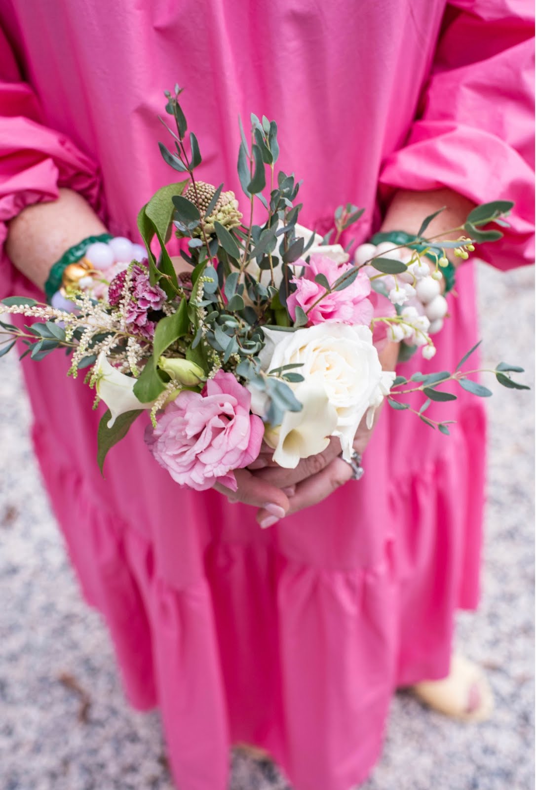
I have never met a pink I did not love and it is evident in our home. Our dining room is a full body pink with the perfect mix of blue and lavender. Pink Begonia by Benjamin Moore will forever be my favorite shade of pink. My office ceiling is the best shade of pale pink and the closest to Rose Quartz. It seems to balance the turquoise in the space and of course provides me with a calming and inspiring space to create blog posts and schedules for our busy family of six. I have found that pink is always a happy and insightful color. One that always brings a smile to my face. For me, any pink is a good choice and Rose Quartz is a beautiful choice for any room or outfit.

Blue ... oh the calming effects of the perfect shade of blue. I honestly can't think of a blue that isn't the perfect shade. I have found blue to be a timeless punch to any decor. Whether it be navy, royal or turquoise, it looks good in any hue or sheen. Pale blue is my go to for a room filled with pink and greens. Our daughter has a room filled with mixed patterns of Lilly Pulitzer fabric and it all is balanced so well with her pale blue walls. Serenity is the perfect back drop to so many colors. Mix in yellow, brown, red, green, black, white, silver ... you really can't chose a color it doesn't play with well.


Pantone describes them as "an inherent balance between as warmer embracing rose tone and the cooler tranquil blue, reflecting connection and wellness as well as a soothing sense of order and peace.
I describe them as two amazing shades of my absolute favorite colors.
Happy day lovies.


My youngest was thrilled as she had decorated with the pale pink in her new apartment. And, I am so bummed that I can't vote for PKL as I don't have FB!!!
ReplyDeleteI've had my bedroom painted BM Queen Anne Pink for years and I just had it painted Revere Pewter. Darn, I could've been on trend this year!!! BTW - enjoyed your talk at ADAC yesterday!
ReplyDelete